Ketcham Medicine Cabinets:
Upgraded Curb Appeal
Overview
The E-Commerce industry is growing exponentially. With that said, it is imperative to have a reliable online presence as a supplier. Ketcham wanted their website to have a greater ROI, and in order to obtain that, a website design overhaul was needed. Not only did the aesthetic need a refresh, but the way in which the information was being conveyed needed to be addressed.
The Goal
Now that Ketcham has a new brand identity, the next step is to match that aesthetic with an updated website.
Tools Used
WIX
JavaScript
Adobe Photoshop
Timeline
September 2020 - December 2020
Why the Change?
There are three reasons why Ketcham sought out to redesign their website...
To help drive sales and increase revenue
Match the modern aesthetic of the updated logo
Appeal to a wider demographic + more luxury clientele
Pain Points
Version 1 of the Ketcham Cabinets site had numerous pain points. The biggest pain point however, was the overall navigation of the site. Users found it difficult to find the information they wanted.
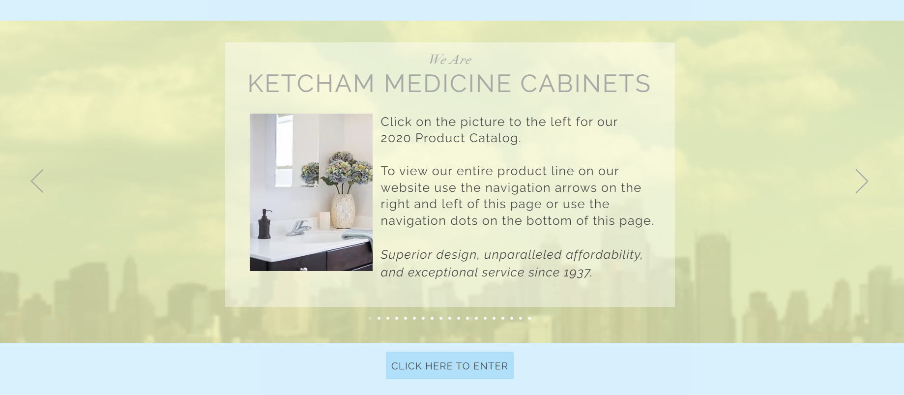
When entering the original site, the user is presented with a splash screen and a "click here to enter" call to action. This was very popular 10 or so years ago, but as the web became more popular, the extra click is exhausting.
Once the user clicks to enter the site, they are now on the the home page. Here is where you can see the different products Ketcham has to offer, ranging from single door cabinets, to washroom mirrors.
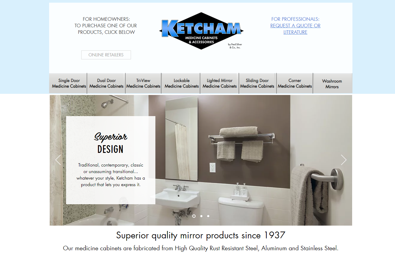
The scrolling banner slideshow shows potential, but that doesn't match the rest of the design. At the top you will notice there is a message to homeowners and professionals. There is no distinguiable difference between the two which can make it more of a hassle to the end user to find the information they need.
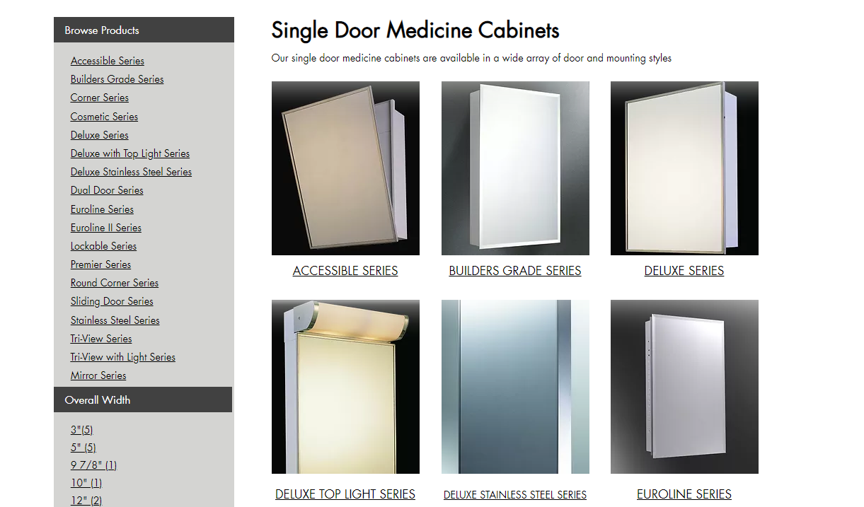
If you are curious about the Single Door cabinets, and you click the first navigation button, you are brought to this screen which showcases the many categories of product that Ketcham offers. On the left hand side you will notice all products they offer, as well as a breakdown of size options by width, height, depth. Right away, the eye has a lot to take in. Should the user look into a series? Or narrow down the search by the filter menu?
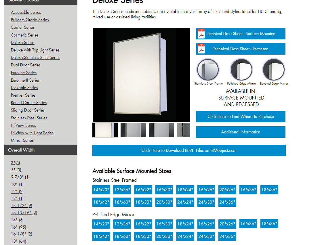
If the user selects a series, in this case the Deluxe Series, we now see a breakdown of what this product line is about. There is a lot of information about this series, which is great! The pain point here is that since there is so much information, it needs to be organized in a more digestable manner.
This series in particular comes in about 16 size options, across three door styles, totaling up to 48 variations in this group alone. Ketcham caters to the homeowners market, as well as the architectural market. For the homeowners who are not familiar with the construction elements of a product, how are they able to see the difference between a 16"x22" cabinet versus a 20"x26"? People gravitate to visuals when trying to shop around for a product they need. This current site does not entertain this.
The Redesign:
NOTE: The Ketcham site redesign took a total of ~3 months to complete. During this time, there were multiple iterations before finalizing the design that is live today. There was active commucation amongst all departments within the company (i.e. Marketing, Sales, Logistics, Executive Board) .
Initial site load
The home page was reimagined. Now with a brighter, cleaner stucture, the home page can breathe.
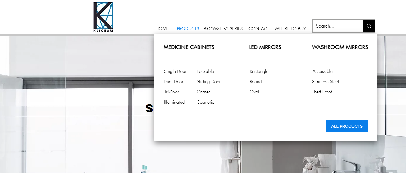
Navigation is made easy on the user by providing an organized drop-down of product categories. The user can now eliminate long click through processes by selecting what they need from the get-go. Should they prefer to browse the entire product line at once, there is an option to select "All Products"
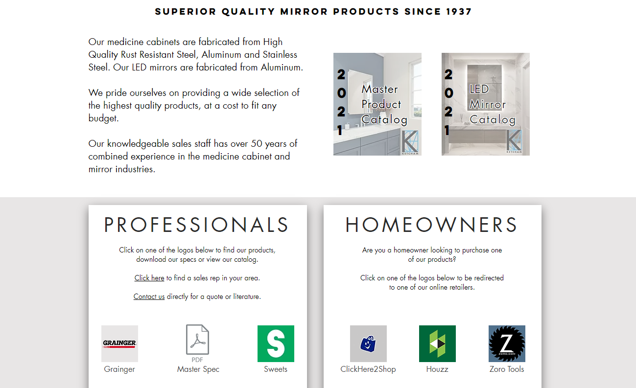
Over the last few years, Ketcham has been aquiring more sales on the Homeowner side. It is important for Homeowners to know their options and the resources specifically for them. The redesign of the home page now separates the homeowner from the professional contractors in one specific area.
The previous design had these resources in the very top corner of the page, with little to no contrast, rendering them almost invisible to the average user.
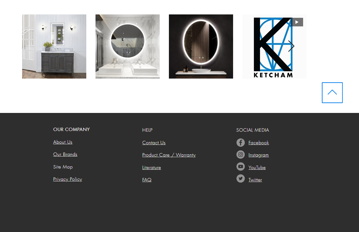
Ketcham 1.0 did not have a useful footer section for the site. Now, with a redesigned footer, there are direct links to literature, Warranty information, Social Media links, and more. This adds more legitimacy to the company site."
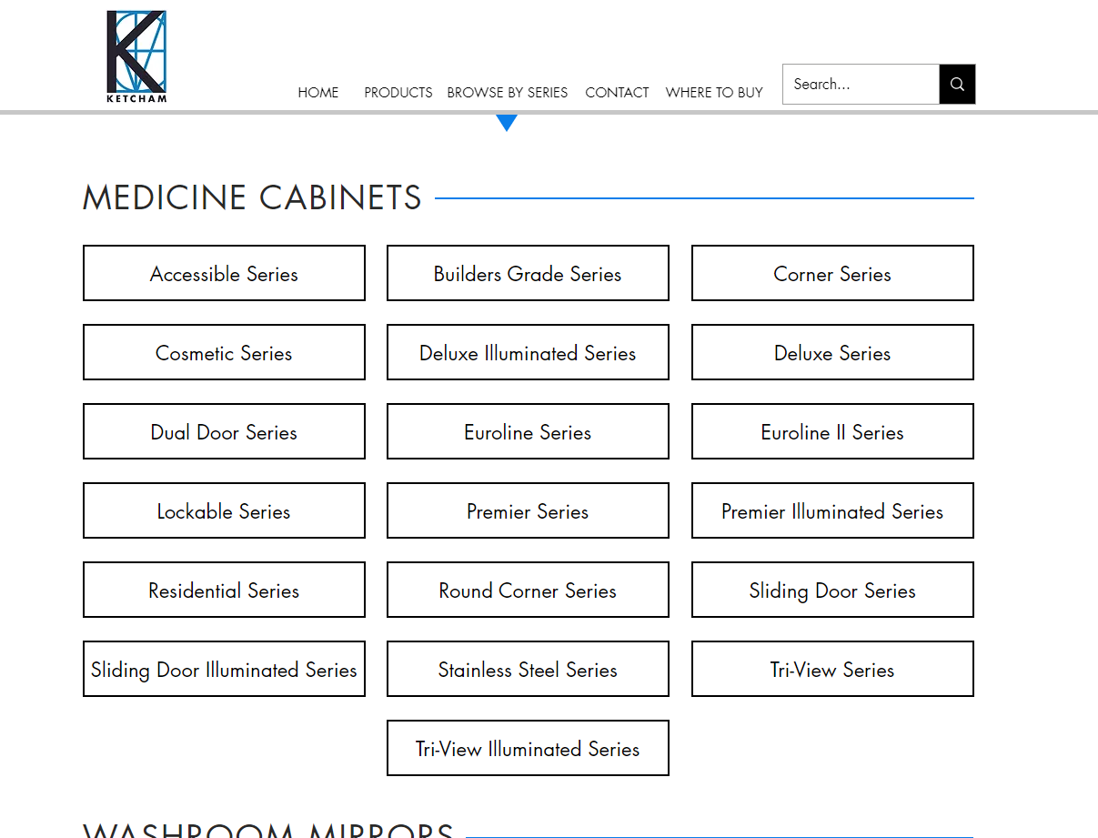
If we choose "Browse By Series" in the top navigation menu, we are brought to a clean page that breaks down each product category and it's corresponding series'. For individuals such as architects or contractors, that know the exact type of product they need, they can get all of the info for that series by the click of one button.
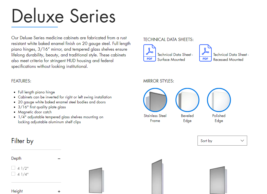
As mentioned previously, Browse by Series allows the user to get an overview of this specific product type. Helpful information includes technical specs, size options, and mirror styles.
At the botton of each Series page, there is a filtered list of all part numbers that live under that Series! This is an easy way to navigate between different size options should a customer be interested in this product line.
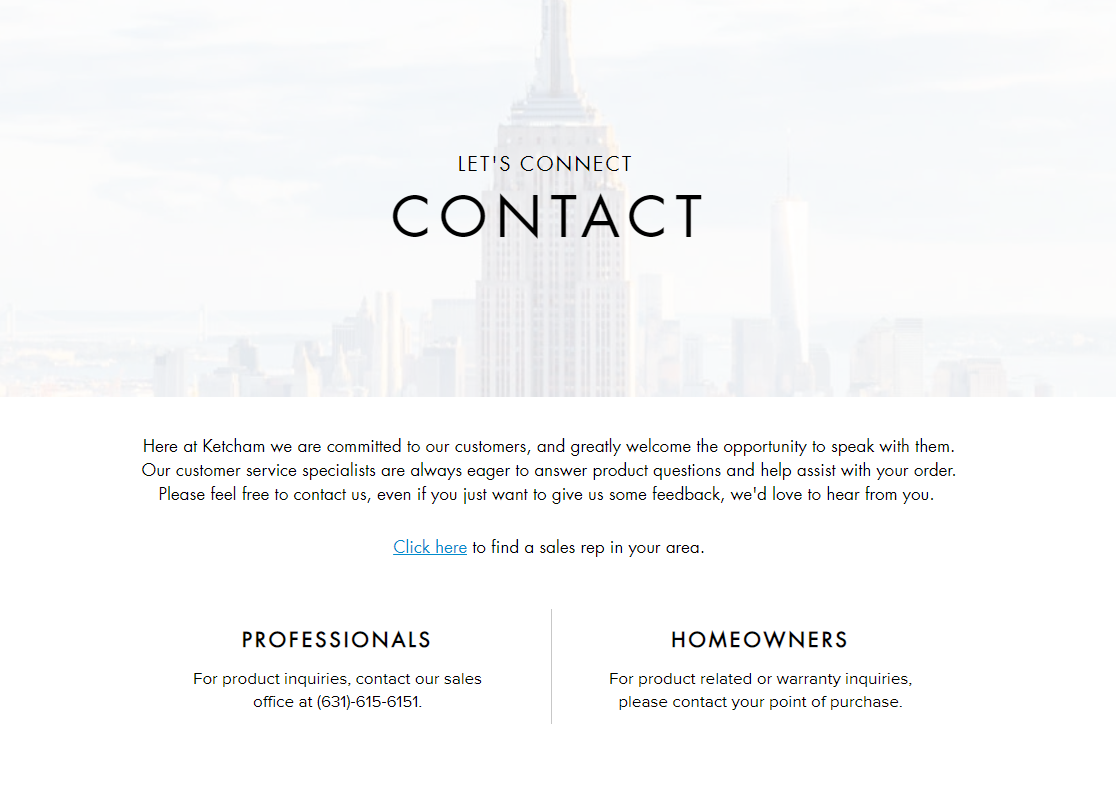
As much as we would all love to have ALL the answers when shopping online for a product, there are still times where we need to know more. The redesigned Contact page is more user friendly and clean. This design is modern, more inviting, and provides the resources you need in order to reach the correct point of contact.
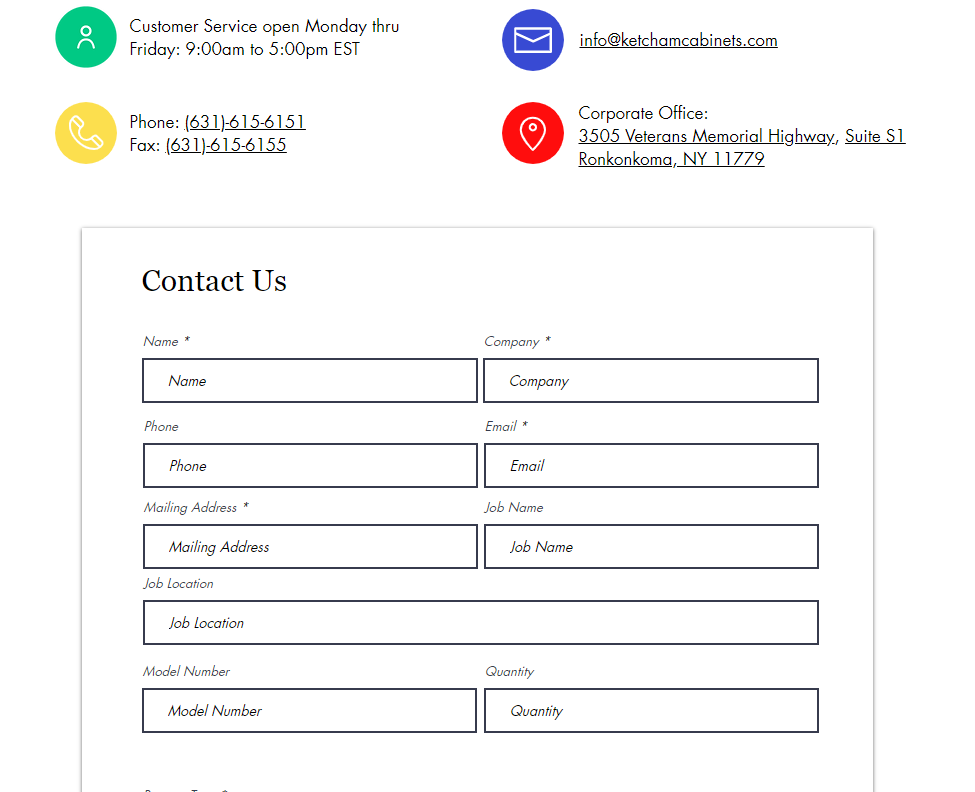
Some visual elements transferred over from the previous site design, such as the colorful icons next to each information block and the contact form for project-related inquiries.
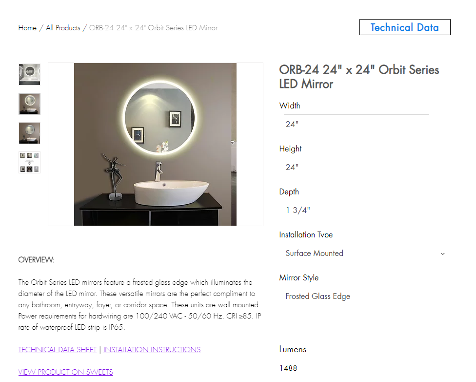
The most important reason for this website redesign, was creating an experience for our users that allows them to learn about each SKU without feeling overwhelmed. After all, Ketcham offers over 450 unique part numbers!
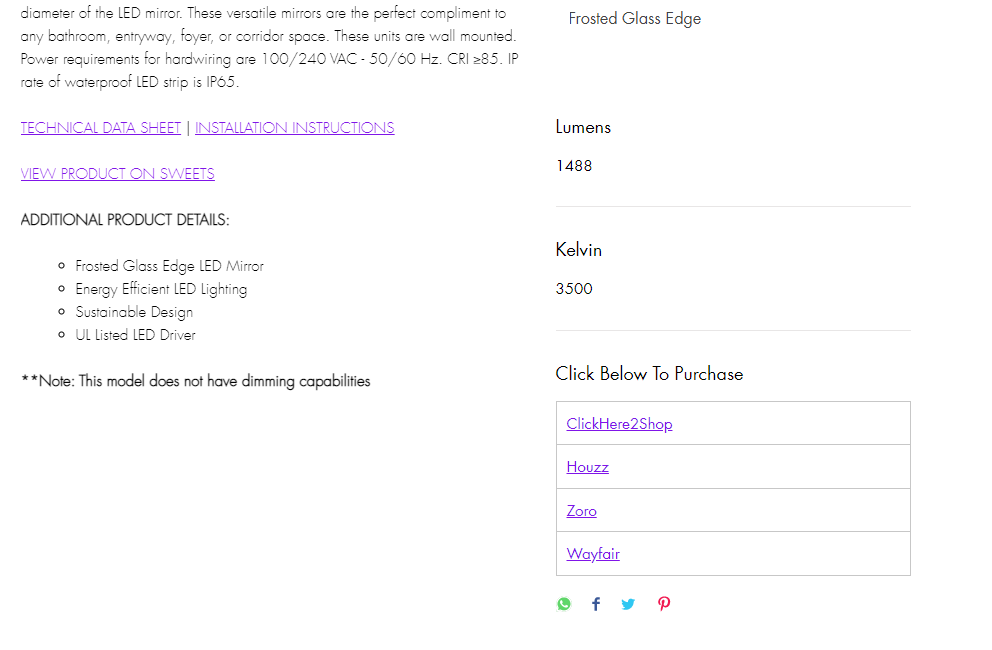
Now featuring an ECommerce-esqe design model, all 450 products have their own product page. Here, you will find everything you need to know about this singular part number, whether that is dimensions, technical data, installation instructions, or power requirements, for those SKUs that have lighting capabilities.
In addition to this cleaned up design, users now have direct links to purchase these products on the online retailers that Ketcham is partered with! This is a win-win for both sides of the equation -- Ketcham customers have one less question to ask as to where they can buy our product, and the point of purchase gets direct traffic and sales!
The Return
After one year of Ketcham 2.0 being live, there was an exponential return on investment.
Ketcham version 1 had about 9,000 site sessions over a year timespan (Sept 2019 - Sept 2020). Comparing that to version 2 analytics, there was a 145% increase in site sessions when comparing 2019/2020 to 2020/2021
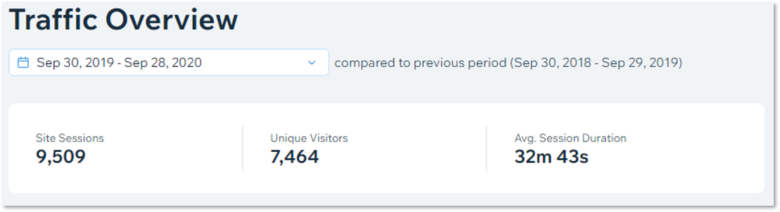
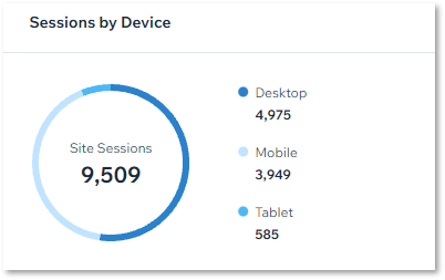
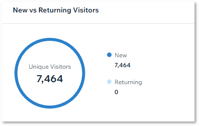
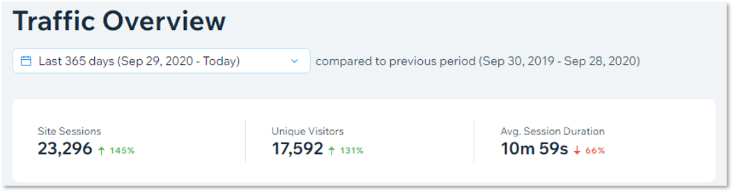
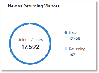
Within this time frame, user growth increased by 131%, and the time spent on the site averaged to about 11 minutes, 21 minutes less than the year prior.
This goes to show that users are able to find the information they need in less time, leading to increased sales and a positive overall user experience.
Intrigued?
View the live deployment of ketchamcabinets.com (2.0) here